IKU – Eat Your World Better
When it comes to plant-based meal delivery, there’s a monotonous swathe of earthy tones and lentils sitting in lettuce leaves. Not IKU though. They came to us in search of a deliciously different visual and verbal identity that would set them apart in the DTC space while still staying true to the roots they put down in their Sydney storefront almost 40 years ago.
What's all this then?
Since opening Sydney’s first plant-based eatery more than 35 years ago, IKU has nourished and healed their customers with simple plant-based meals. Thanks to their innovative vision, delicious vegan dishes and the support of their community, they’ve now stepped beyond the storefront to offer an online delivery and retail service that brings a whole new level of ease and accessibility to IKU.
Any insights?
Research shows that switching to a plant-based diet is the single most powerful thing you can do for your health and the planet. As more and more Gen Z and Millennial people work toward aligning their values with their purchasing decisions, we’ve seen a huge boom in popularity for plant-based products.
The thing is, while more and more people are coining onto the environmental and physical health benefits, “vegan” is still a term more strongly associated with activism than lifestyle and vegan (or even just “healthy”) food is often considered boring and limited. And, despite IKU’s rich history in Sydney, the healthy, DTC meal space is a monotonous blur of nationally-nameable brands.

And what seems to be the problem?
IKU needed a strategic visual and verbal refresh that would not only nod to their rich history but maintain their local vibe as it grows to a national level. So how would we leverage the friendly, feel-good essence of the IKU brand to make healthy, plant-based ready-meals so desirable that people would go out of their way to buy them?
So how'd you go about it?
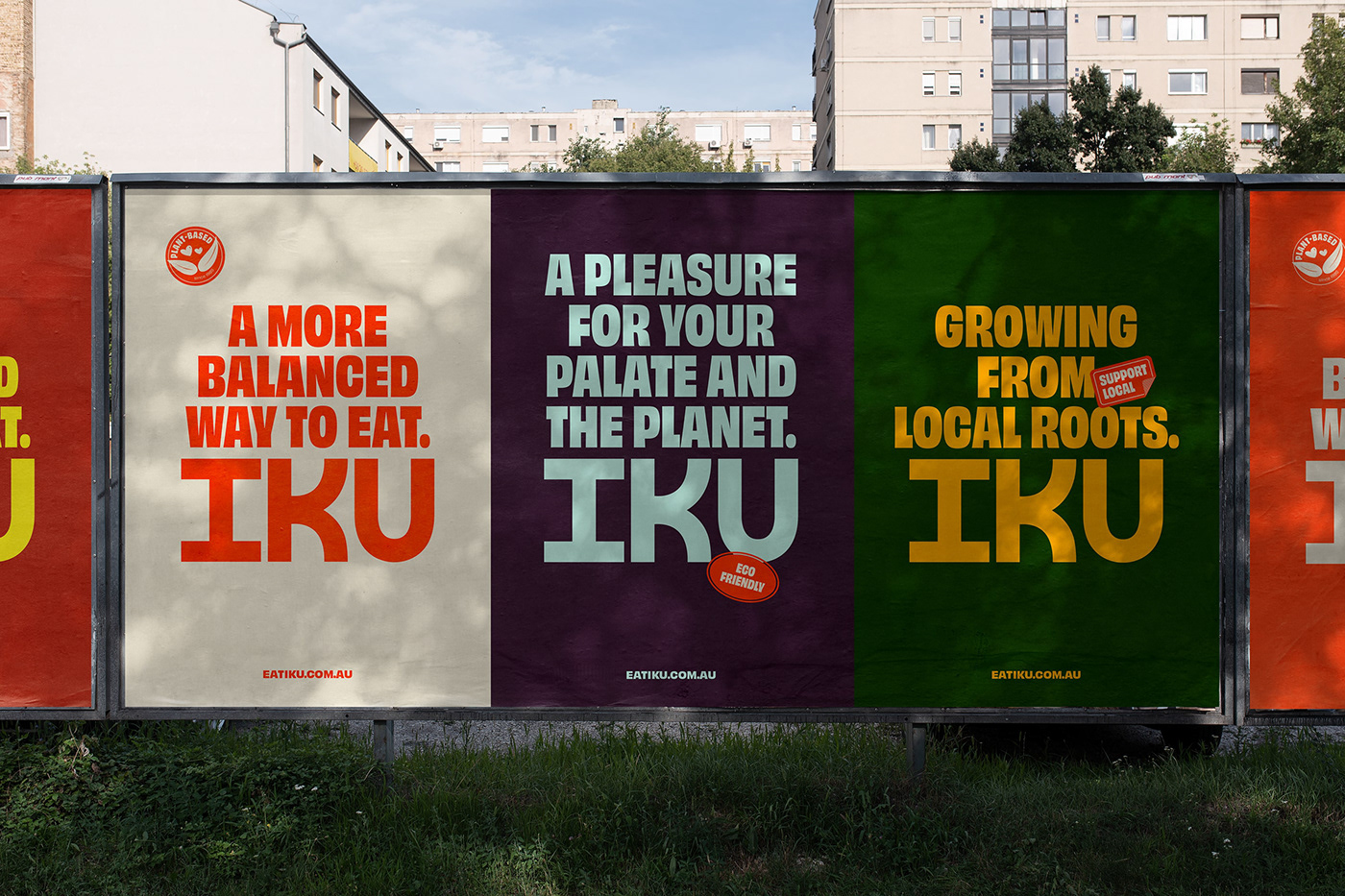
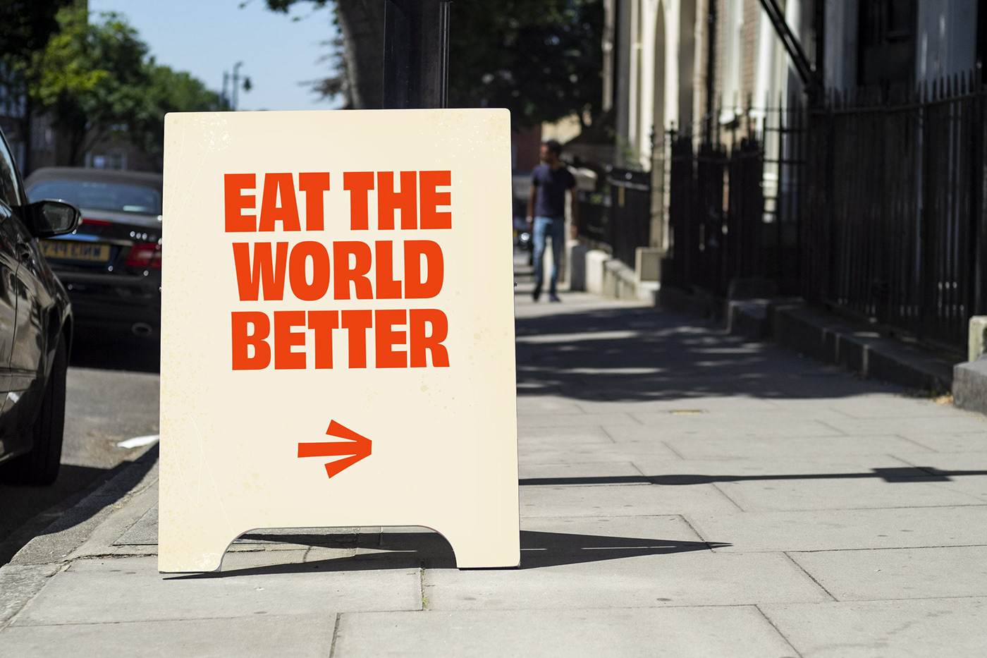
It began with strategy. Alongside the team at Untangld, we established a sustainable competitive advantage that would avoid the category’s obsession with “easy” and “healthy” and own the emotional highground of how a mouthwatering meal can genuinely help the planet. The idea? Eat your world better.
Everything IKU does — from the food they make to the way they run their business — is about keeping things in balance. Each meal they sell is balanced with a charitable donation. To balance out their production impact and minimise waste, all of their packaging is as recyclable and compostable as (currently) possible. It made sense for the visual identity to speak to something so inherent to the way they operate.
Sinking our teeth into the identity
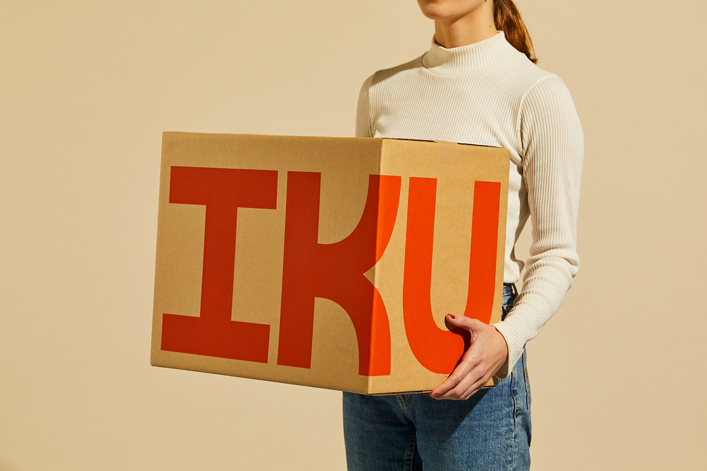
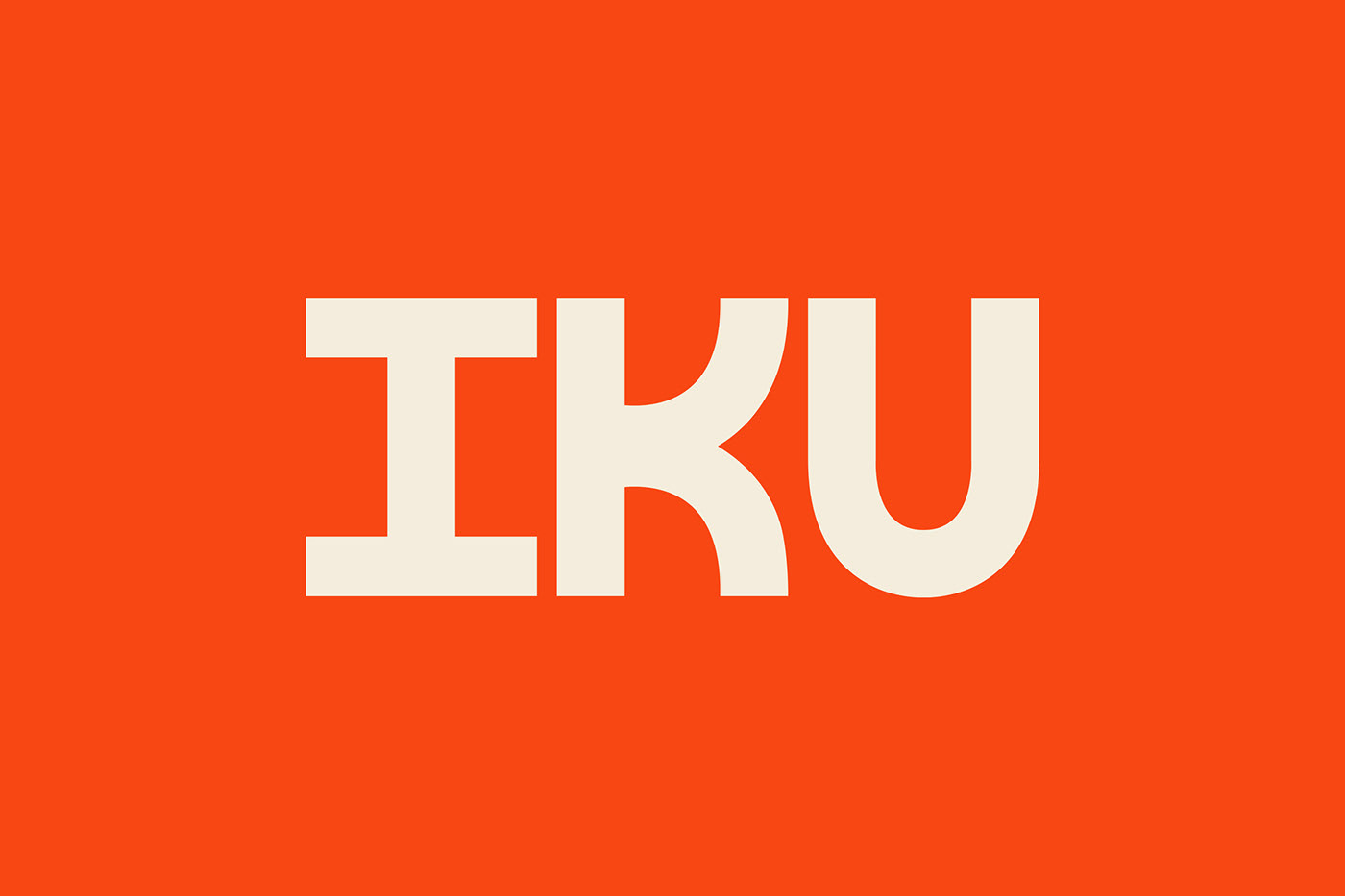
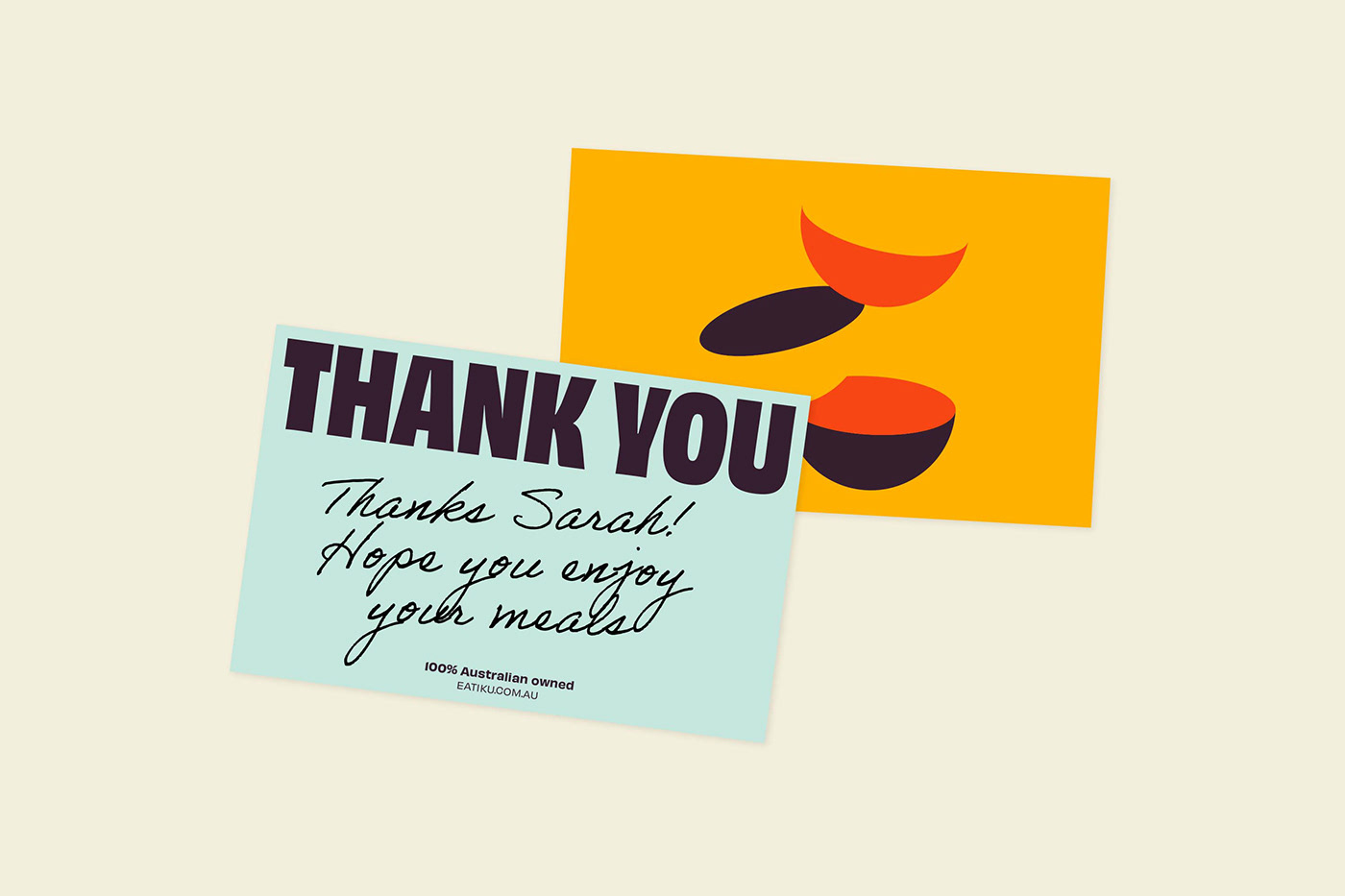
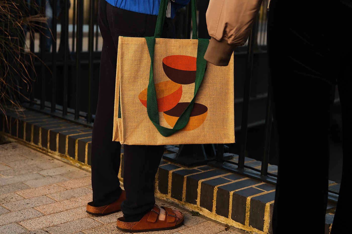
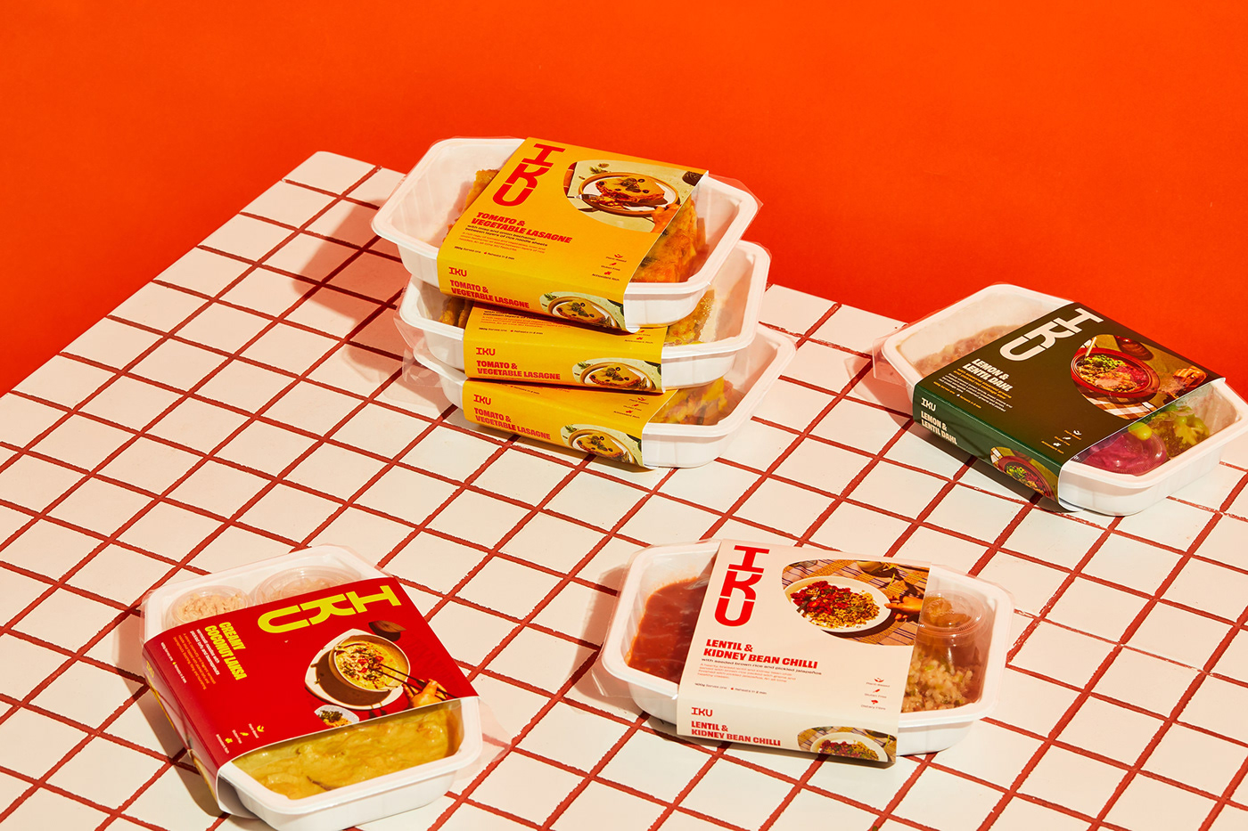
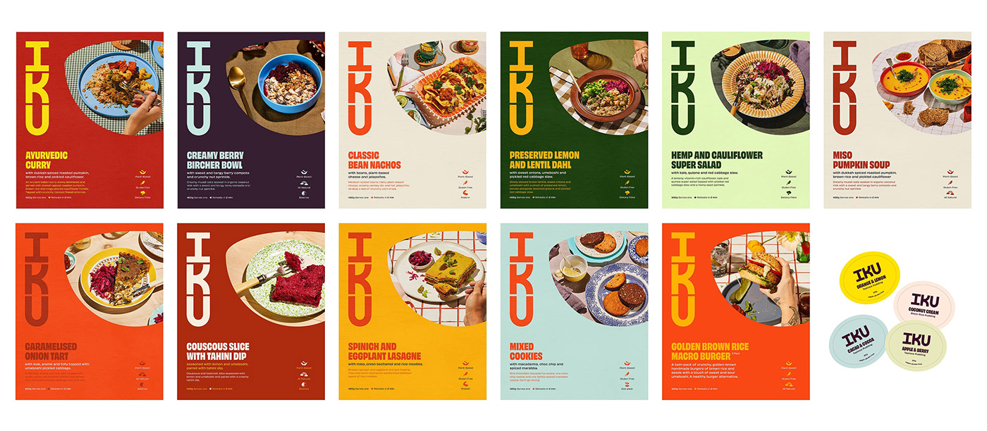
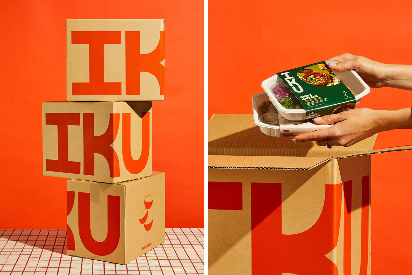
Each letter of the custom wordmark is perfectly balanced and sits vertically as a nod to their Japanese name. The stacked bowls reference the nutritionally-balanced meals they create, while complementing the wordmark and also giving the brand a flexible visual element to be used as a graphic or image container.
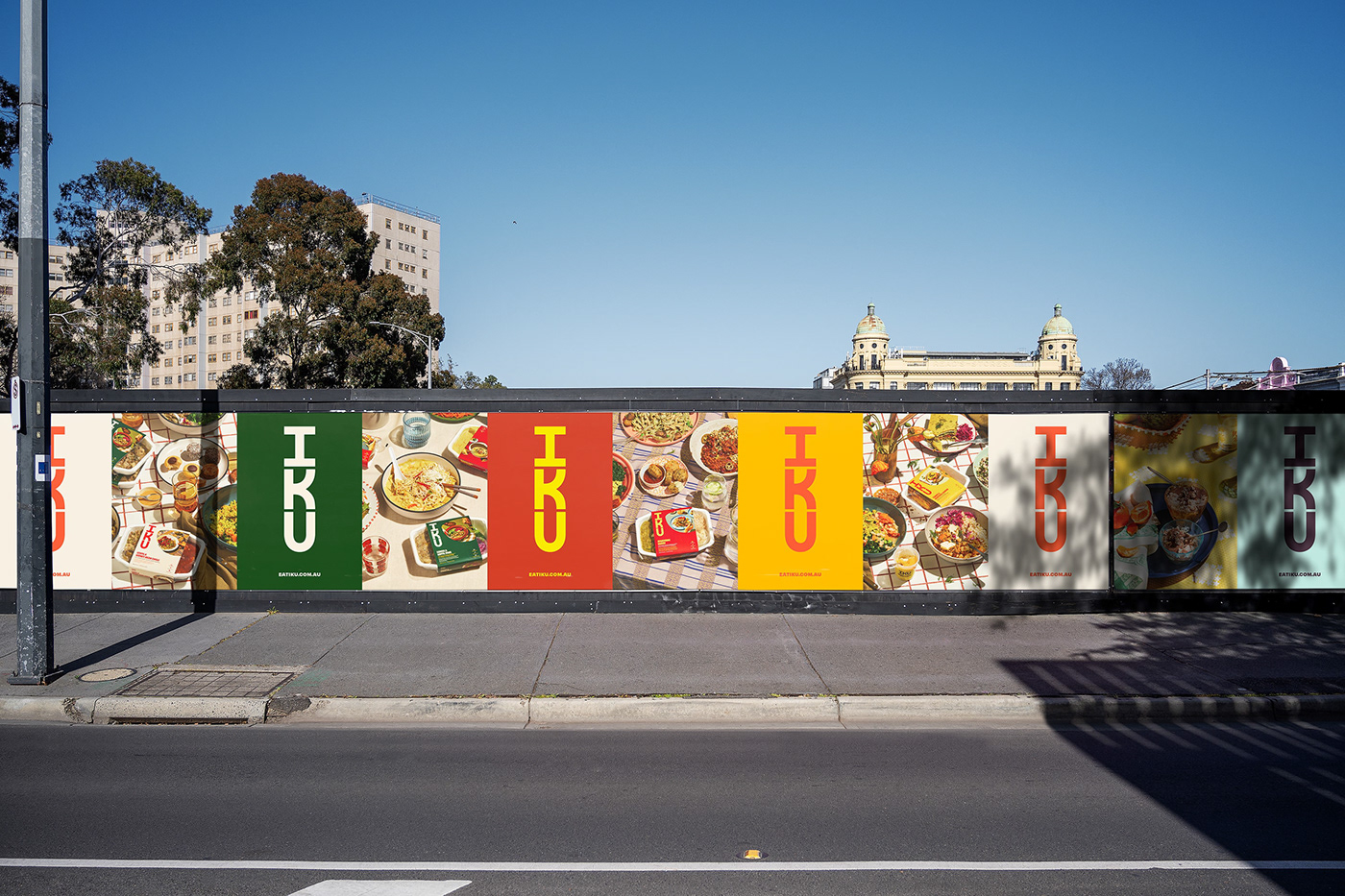
In a category that’s quite literally greenwashed, the colour palette is a deliberate divergence from the muted, “natural” and green tones the audience has come to expect of plant-based brands. It feels delicious, exciting and celebrates the colours of some of IKU’s favourite ingredients.

A delectable dialect
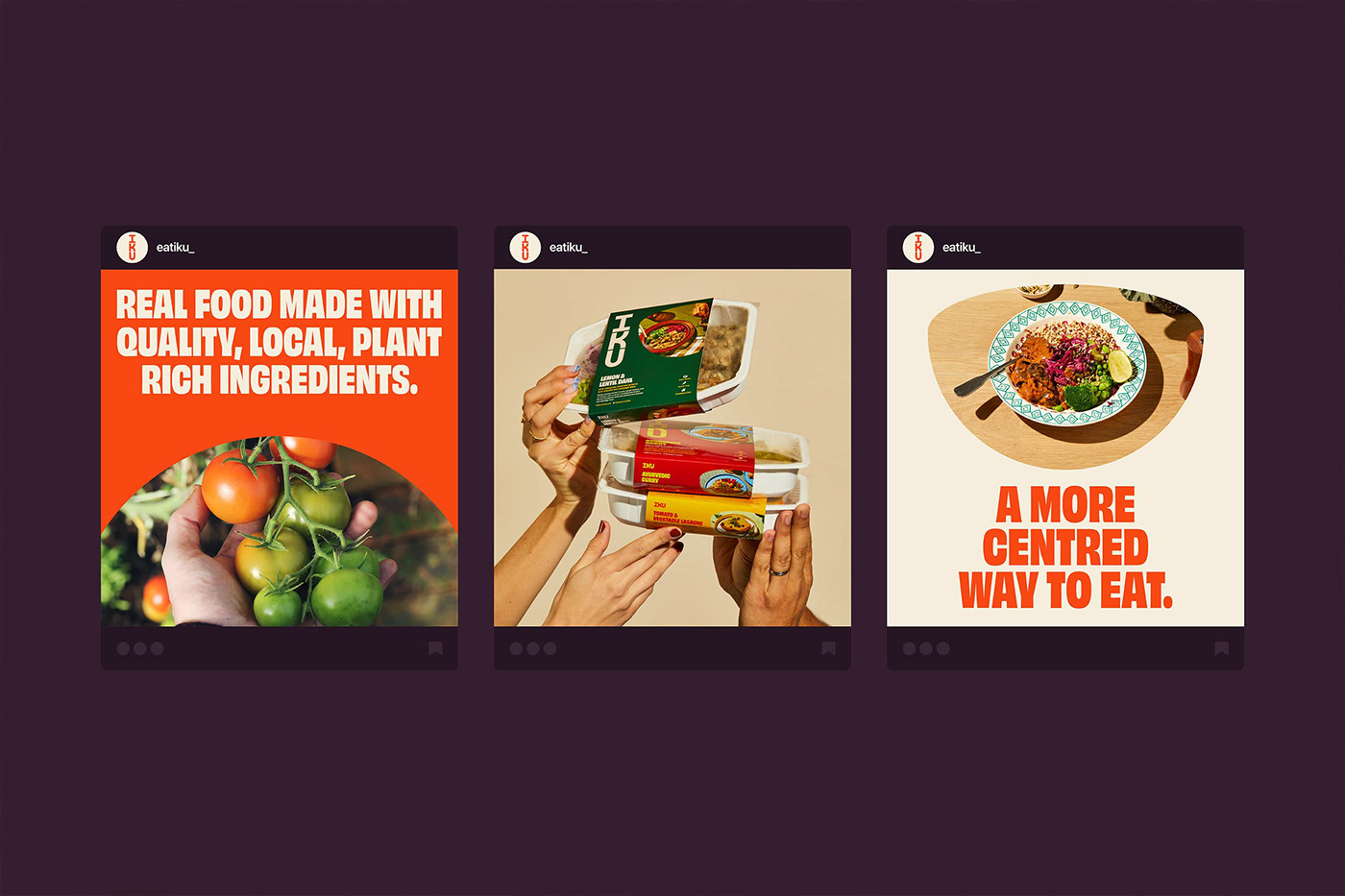
The typography is confident and full of personality, which is mirrored in the verbal identity. Working with copywriter Cat Wall, we created a tone of voice and suite of messaging that reflects the honest and authentic nature of both the brand and its offering. Much like their food, it’s enticing, leaves you feeling good and there’s nothing fake or pretentious about it.
Big taste, low on waste.
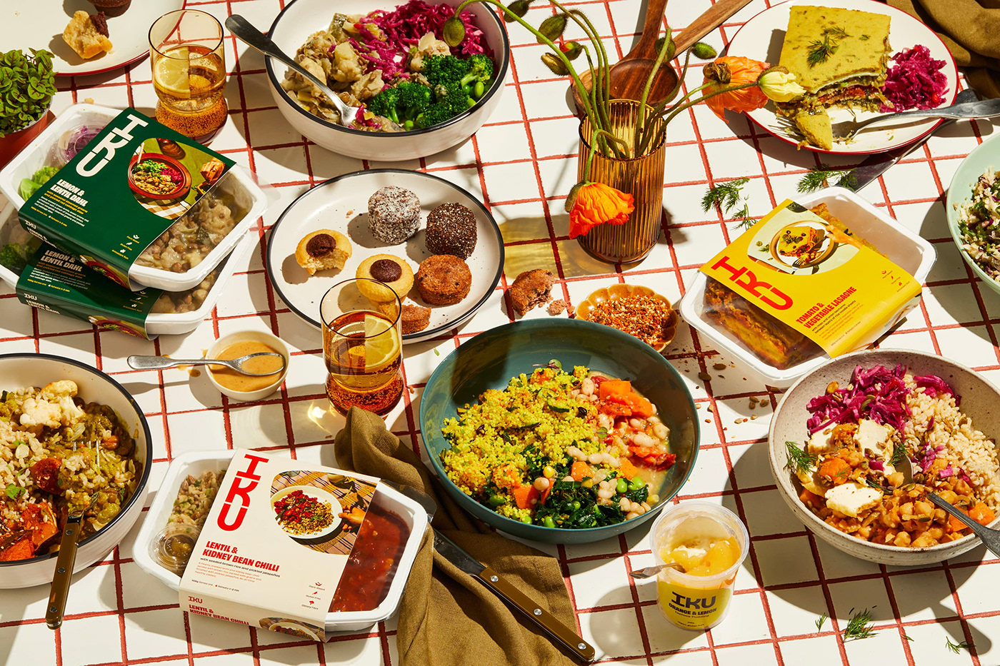
Packaging was an opportunity to use the extended colour palette to visually categorise IKU’s extensive menu, making it easy for the customer to distinguish between curries, savoury snacks, desserts etc. Ensuring the IKU story and belief in balance isn’t lost when it comes to their products, the back of each pack gives an insight into their history, while the mailer box stacks to mimic the logo.
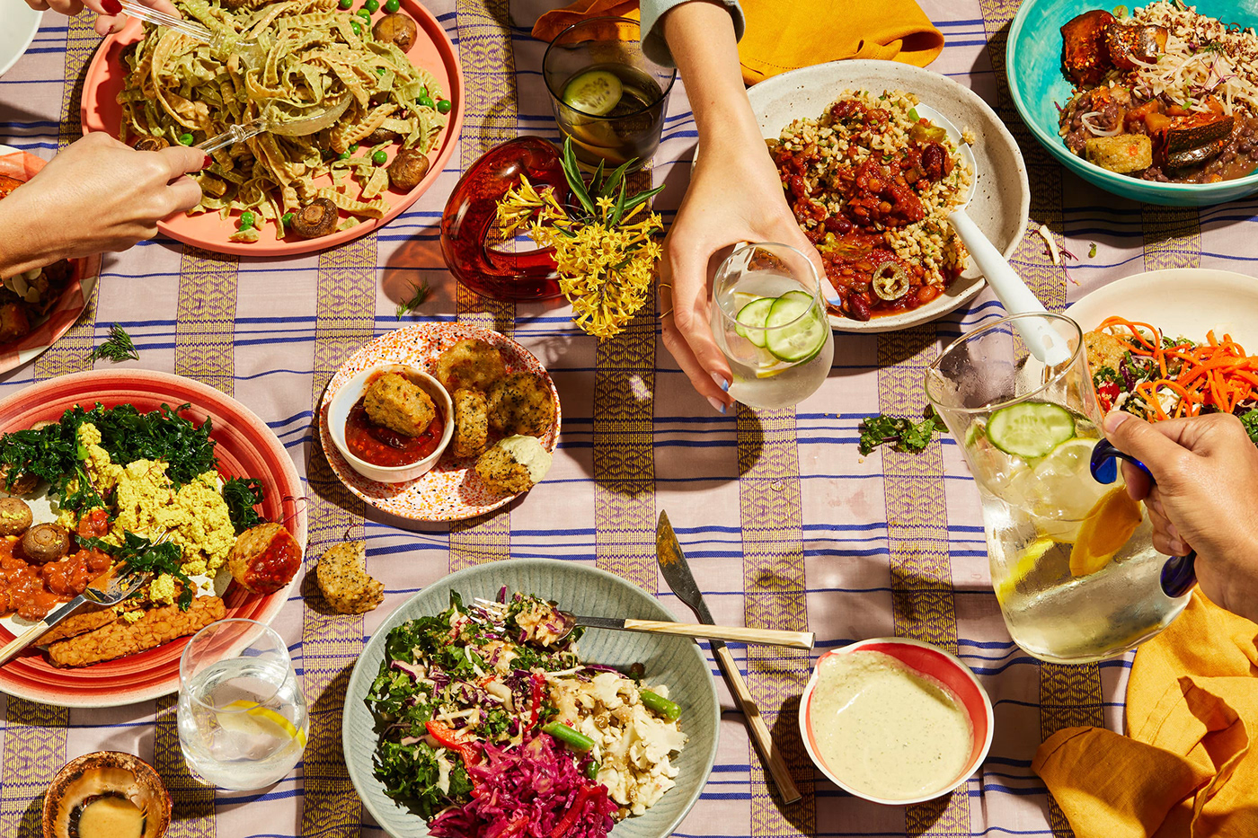
A feast for the eyes
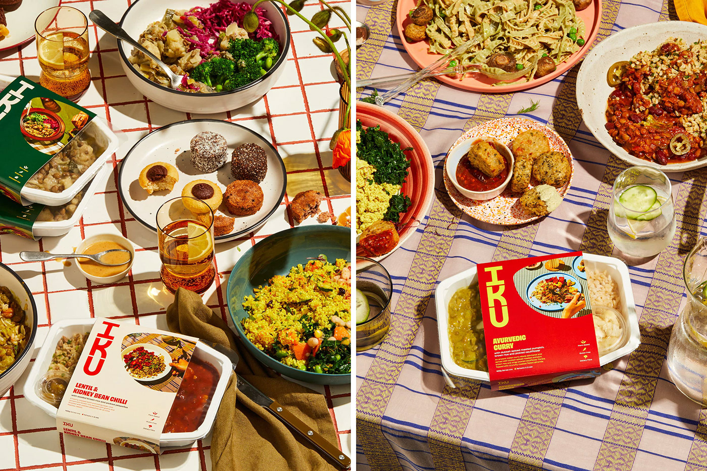
Having noticed that much of the photography in the category felt humanless, stark and uninviting, we wanted to give IKU a clear point of difference that strayed away from the “perfect” overhead meal shot. With Benito Martin working his photographic magic and Jessica Johnson slaying the styling, we produced a suite of images that not only celebrated the food itself, but the beautiful moments (and mess) that shared meals at a homely kitchen table create.


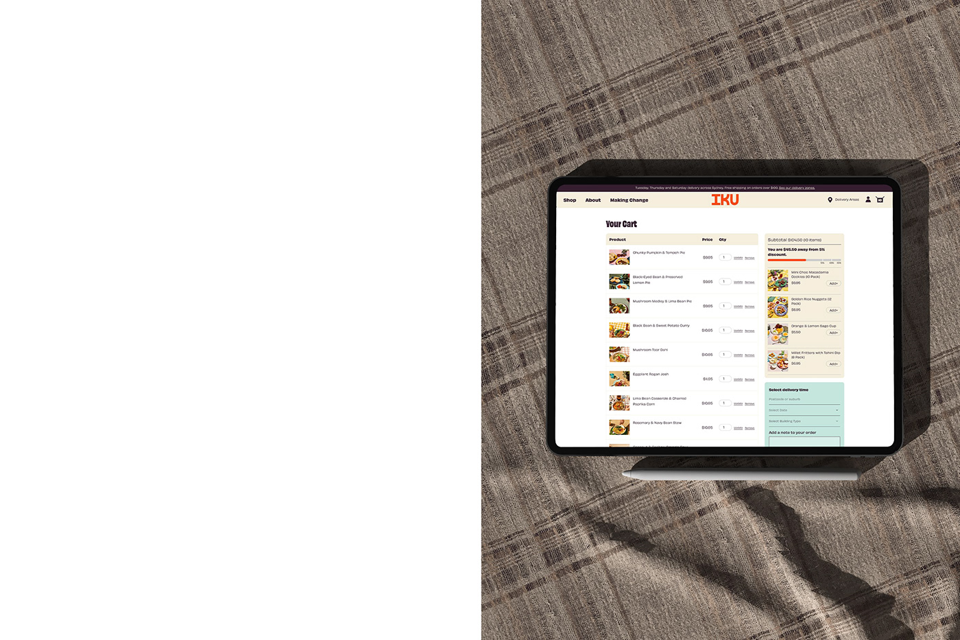
And then came digital deliciousness
The aim with the website was to keep things bold and vibrant while putting the food front and centre — refreshing the brand for long-term IKU customers and creating something that stood out from a swathe of DTC competitors for the newbies. But keeping IKU’s heralded history in the mix was also important, so we used the About page as an opportunity to create a rich visual timeline, with a series of photographs from the original store in the ‘80s right through to where IKU is now.
And the end result?
IKU’s identity is now as vibrant and enticing as the food they create. It’s a beautiful and inviting celebration of all the ways in which (plant-based) food can change your world. By channeling the past and remembering the foundations they were built on, we were able to create a brand for both the future of their business and the planet.